Optimizing your ecommerce checkout process is crucial to reduce cart abandonment rates, as it affects customer satisfaction and the likelihood of returns. If the checkout process is not smooth and simple, the customers may abandon their carts without making a purchase and may not return to your ecommerce.
This article shares the best practices for optimizing your checkout process and boosting your sales.
What is Medusa? Medusa is a leading open source set of commerce modules that gives developers and businesses the flexibility to build sophisticated and unique digital experiences. One of Medusa’s building blocks include a Next.js storefront that implements all the checkout best practices mentioned in this article.
10 Ecommerce Checkout Best Practices
Don’t Force Customers to Create an Account
Forcing customers to register means you are creating an obstacle for customers who want to buy, ultimately increasing abandoning carts. Therefore, offering a guest checkout option helps you to increase the chances of a sale.
Allow guests to checkout and complete their purchases with an email address to make the checkout experience more effortless.
In addition, you can allow customers to log in using their social media accounts, including Facebook or Google, to simplify the checkout process and eliminate the need for registering and entering personal information.
Alternatively, let the customer have the option to create an account by adding a checkbox that prompts them to choose whether they want to create an account. When customers select this option, a password field should appear, allowing customers to set a password. This way, the customer must only fill in an extra field for the password.
Don't
- Force customers to create accounts to fill their carts or to complete the checkout process.
Do
Allow customers to checkout as guests.
Make creating an account simple by enabling social login and by one-click creating an account.
Ask Only for Necessary Information and Enable Auto Fill
Avoid annoying the customer with extra steps and information, as this may make their shopping experience time-consuming and uncomfortable.
To ease the checkout process, keep the forms concise by requesting only essential information about the customer. Eliminate any unnecessary steps and clearly describe why certain information is required. For example, avoid asking for non-essential details, including Address 2, birthday, gender, or company name. Add a single field for the full name instead of separate fields for the first and last name.

Clarify why this field required on Amazon
In addition, make sure to enable Autocomplete Attribute for input elements. This helps speed the process up by making billing and shipping addresses auto-fill as soon as the customer starts typing. Most browsers like Firefox, Google Chrome, and Safari support this feature.
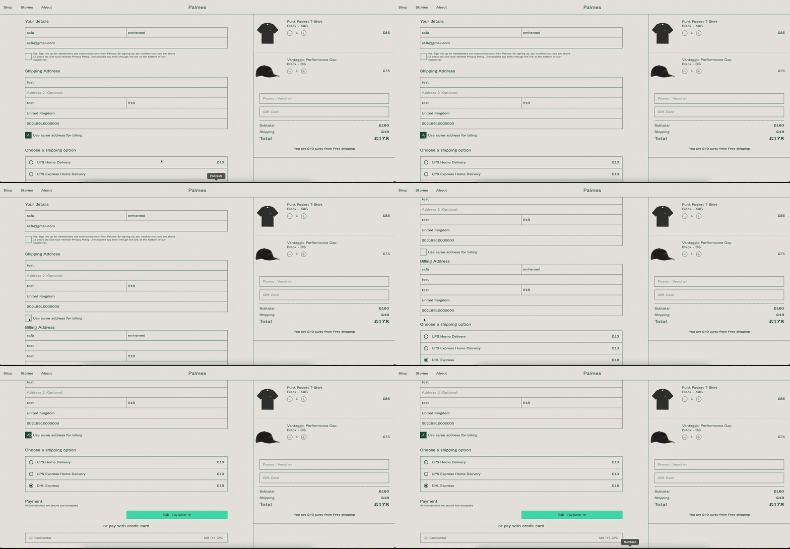
Furthermore, offer a checkbox to enable customers to use the billing address as the shipping address, simplifying the form-filling process and making it more efficient. You can automatically populate the form with email, shipping, and billing address information if the customer is logged in. However, allow customers to change this information if needed to streamline the process.

Checkout on Palmes
Don’t
Ask for unnecessary information, including age, gender, company name, and more.
Make the form too long to fill.
Do
Enable auto-fill for all checkout form input fields.
Let the user use the same address for shipping and billing. If the customer logs in, fill in the payment and address information form account information.
Offer Multiple Payment Methods
Support multiple payment options when purchasing online, especially for ecommerce that supports global shipping. This ensures a seamless payment experience for the customer.
Provide a variety of payment methods that customers in different locations can use, and set the most popular methods first. That allows customers to pay with the preferred payment method that suits them and helps you to increase your credibility.
Most customers prefer to use common credit or debit cards from Visa or Mastercard, but many alternatives have emerged in the last few years. You should consider including payment options such as Apple Pay and Google Pay.
Don’t:
Limit payment options on your ecommerce.
Use uncommon payment methods that confuse the customer.
Do:
Provide a variety of payment methods.
Consider Mobile payments and e-bank transfers, not only cards.

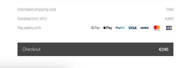
Payment Method on Tekla
Use Descriptive Form Labels
Form Labels are an essential part of accessibility. Good labeling can guide the customers to add the correct information.
Keep labels short and descriptive, telling the customer what the input fields mean and that the form is easy to read and scan. For example, instead of using “Where do you live?” or “Where would you like to receive the package?” use the label “Address”. Customers will recognize what information they should add.
Don't use the placeholder as a label because the placeholder disappears when the customer starts typing. Still, the label or the floating placeholder remains visible after the field has been filled in. That helps customers remember what exactly the purpose of the field is.
You can use the placeholder with the label as a description or example of the required information for the field.

Pincode placeholder on Amazon India
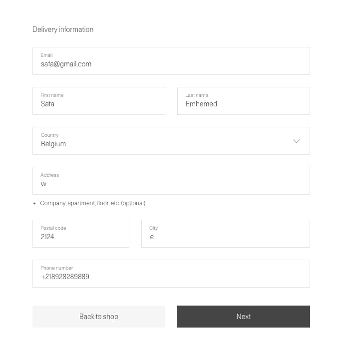
Place the label above an input field so the customer is not forced to look separately at the label and the input field, which results in a quick and easy completion time. Make the label font clear and bold.

Checkout Form on Tekla
Don't:
Use long-form labels.
Use a placeholder as a label.
Do:
Use the placeholder as a description for the input information.
Place the label above of input fields.
Highlight Required Fields and Use Clear Validation Messages
Form validation ensures the customer’s data entered into a form meets the requirements and serves as a communication point during checkout.
To save your customer time and prevent errors, highlight the required fields and provide clear instructions on what they need to pay attention to while completing the process. If a customer enters incorrect information in a field, provide concise and informative validation messages to guide them on fixing the error and moving forward quickly in the checkout process.
Place the validation message near the field with the error to draw the customers' attention and avoid the need to search for the field.
It’s also important to notify customers of any invalid or missing input fields in real time before proceeding to the checkout process's next step. This way, customers can address any issues without retracing previous steps later.

Checkout Form on Tekla
Don’t:
Add broad messages such as “there’s something wrong” when there is an error or invalid data.
Use long validation messages.
Do:
Highlight the required fields.
Make validation messages specific, concise, and informative. And use field validation in real time.
Make The Checkout Page Mobile Friendly
With the growing number of people using mobile phones for online purchases, it’s essential to create a seamless mobile experience and optimize your checkout process for the success of your ecommerce business.
On smaller devices, use wide checkout buttons and large fonts to minimize this risk and help customers to complete a purchase smoothly without any obstacles. Also, avoid placing two or more fields in a single row. Instead, use individual rows with labels for each field; this ensures a smooth sequential transition through the checkout process.

Checkout Form on Tekla
Don’t:
Place more than one field in a row.
Keep the buttons and fields small.
Do:
Make the form fields vertical and use wide buttons on small devices.
Put one field in a single row, a maximum of two fields for short inputs.
Highlight Security and Privacy
The more secure your ecommerce is, the more trust and credibility you establish with your customers. They can confidently purchase through your ecommerce with their sensitive payment information, billing, shipping, and personal information.
Show the payment methods with the original payment gateways logo, such as Visa, MasterCard, and PayPal, to offer customers a transparent and secure experience.
To further earn customer trust, display security certifications or trust seals like Norton and Better Business Bureau at the checkout screen, showcasing your ecommerce protection. Adding Extended Validation Certificate (EV) can help your customers to comprehend your ecommerce verification and display a green assurance bar with your ecommerce name.
Having an SSL certificate with HTTPS also reassures customers and motivates them to move forward in the checkout process.
Don’t:
- Let the checkout process without security options.
Do:
Use original payment gateway logos, including Visa, MasterCard, and PayPal.
Use certifications or trust seals like Norton and Better Business Bureau.
Add SSL certificate with HTTPS.
Show Checkout Progress Bar
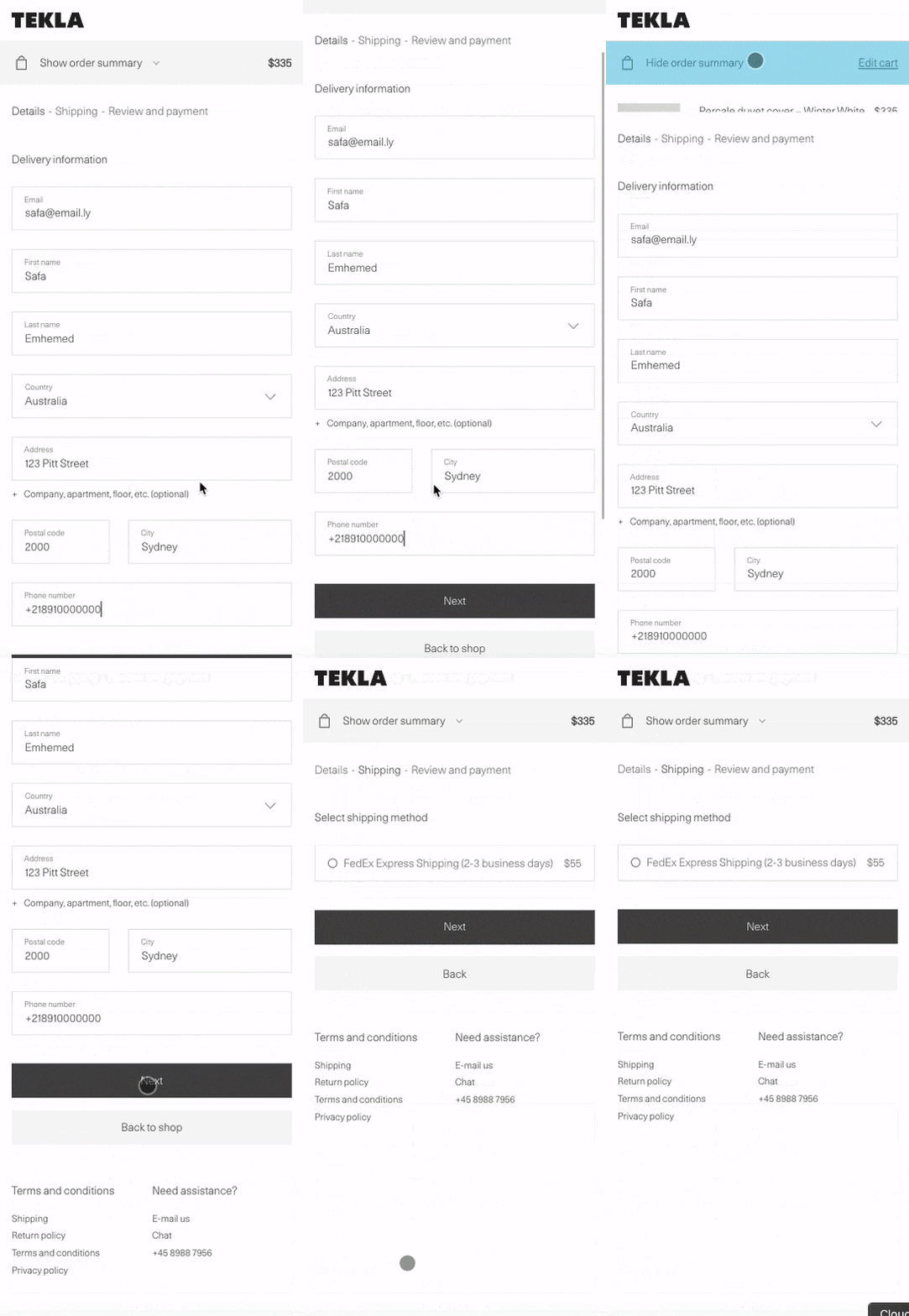
When customers don’t know how long the checkout process will take, they might abandon their checkout process. Prevent this by adding a progress indicator that allows them to track their progress and know where they are in the checkout process. It guides and shows the customer what to do during the checkout process.
Make the progress indicators with the fewest steps to show the customers how quick checkout will be. The design should be clear, with each status indicated by a different color.
Add a descriptive label for each step instead of just displaying a number. For example, Step 1-Personal Details, Step 2- Shipping Details, and Step 3- Payment Details. This informs customers what they need to complete the purchase.
Offer customers a back option if they need to edit their address or make any other changes. Also, always save the progress if the customer wants to exit and return later.

Checkout Indicator on Tekla
Don’t:
Make the process too long.
Reset the information in case the customer is back.
Do:
Make the indicators in as few steps as possible.
Make the steps clear visually and add a descriptive label for each step.
Improve Website Performance
Improving site performance is important for any ecommerce website. Poor performance, including crashes and slow loading times, can lead customers to abandon the checkout process. Therefore, good performance can encourage the customer to complete the process and lead to increase conversions and sales.
Make sure to use a hosting service that fits your ecommerce and customer traffic. Avoid shared hosting and opt for VPS or cloud hosting, which allows you to scale performance according to your needs.
Test your ecommerce with tools like Pagespeed Insights and GTmetrix to evaluate your ecommerce and identify areas for improvement.
Website speed is impacted by the number of files the browser has to request to load a website, causing delays in loading time. To speed up your website, reduce the number of HTTP requests by removing unnecessary elements, features, and plugins, minifying code, compressing assets and utilizing Lazy Loading. Lazy Loading allows the browser to upload assets while customers are scrolling, sending requests only for the visible portion of the page, which speeds up the initial loading time.
Don’t:
- Don’t send too many HTTP requests.
Do:
Test your website with performance testing tools to discover improvement areas.
Use lazy loading.
Add Upsell and Cross-Sell
Upselling and cross-selling strategies increase customer satisfaction and result in additional purchases, making them an easy win for increasing sales. Upselling involves encouraging customers to purchase higher-end or premium versions of the products that the customer selects. And coss-selling encourages customers to purchase related or complementary products to the ones selected by the customer. Offer product bundling to make the customer buy more products with fewer steps, and offer a special price or discount on the total amount of product bundling, making them feel like they have received a good deal. However, it’s important to only suggest relevant products based on the customer's browsing history or car content. Avoid suggesting products the customer doesn’t need, as you could lose credibility.
Don’t:
Offer product bundling with products not relevant to each other.
Show products that customers are not interested in.
Do:
Offer product bundling.
Offer a special price or discount for product bundling.
Conclusion
A well-designed checkout process is one of the most critical aspects of success in your ecommerce. This process determines whether potential customers become loyal or abandon their carts.
Optimizing the checkout process covers several elements, but it mainly involves ensuring customers can complete the process quickly and easily with a few steps. It’s important to ensure that the checkout process is enjoyable for the customer, without any boredom and difficulties that could discourage them from buying.
Developers can utilize Medusa to build a checkout experience tailored toward their users. There are no limitations in how they build it or what tech stack they use. You can learn more about Medusa and what it offers in its documentation.
