I am a UX specialist experienced in both developing and texting great UX experiences.
For this article series, I’ve spent time digging into some of the best ecommerce sites for B2B and zoomed in on what makes them stand out on their UX.
I will go through and dissect the best B2B websites I’ve found one by one. Hopefully, this gives you some inspiration to take into your ecommerce site.
Series overview
More to come this week!
Medusa’s UX and B2B Focus
Medusa provides bespoke commerce infrastructure through its composable commerce platform. Its extendible and open setup makes it well-suited to support cases that require setup flexibility and is easy to customize.
Medusa’s headless architecture makes it possible to build bespoke storefronts that can be optimized to provide a great UX, leading to customer conversion. This is needed in a B2B setting, where most stores are not set up well to cater to the particular needs of a B2B customer.
If you’d like to know more about our product and how we serve B2B users, feel free to visit our B2B page.
Amy Myers MD
Amy Myers MD store provides high-quality natural supplements, free of binders, additives, fillers, artificial ingredients, and chemicals.
Its B2B ecommerce website is carefully designed. It offers more than enough quality information on its products via descriptions and images. It efficiently provides customers with all the details they need.
This article explores some of Amy Myers MD’s powerful UX, such as:
Great on-site search experience: utilize your search bar to provide your customers with the results they’re looking for.
Seamless cart and checkout flow: provide your customer with the necessary features to encourage them further toward purchase.
Effective product-listing page: showcase your products in the best light, with enough information to build up the customer’s curiosity.
1- Optimized Search Experiences
In B2B, website search is crucial. B2B customers often already know what they want to purchase and need the ability to quickly and easily find what they are looking for. A good search UX would allow the customer to do just that.
Some of the features that they implemented to provide a good search experience:
- On the website, customers can choose to search from different domains of the website such as the store, help center, and more.

- Once the customer starts writing the query, they can see the result in a drop-down menu. The results show a photo and the price along with the title. This helps the customers to make an informed decision.
-914c672a.gif)
- On the search results page, if the product name includes words from the search query, these words are highlighted. This allows the customer to focus on products that are potentially more accurate for their query.

- There is a search bar in the middle of the home page. This search bar shows trending searches on the website. That increases the customer’s curiosity to know more about products and might encourage them to purchase.
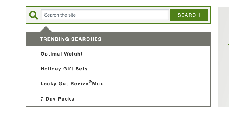
- The search bar is sticky at the top of the page so customers can search no matter where they are down the page.
2- Seamless Cart and Checkout Flow
The shopping cart and checkout pages are major deciding factors in making customers satisfied and reducing abandonment. It can also increase customer loyalty as they’ll feel more comfortable purchasing from your store again.
Some of the good UX that Amy Myers MD implements:
- Customers can check out as guests. This makes the purchasing process faster and easier. The less steps a customer has to take to place an order, the higher the chance they’ll go through until the end of the process.
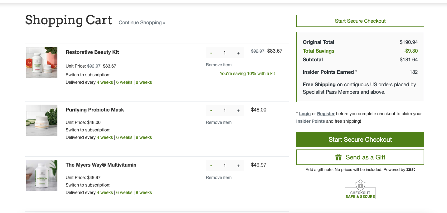
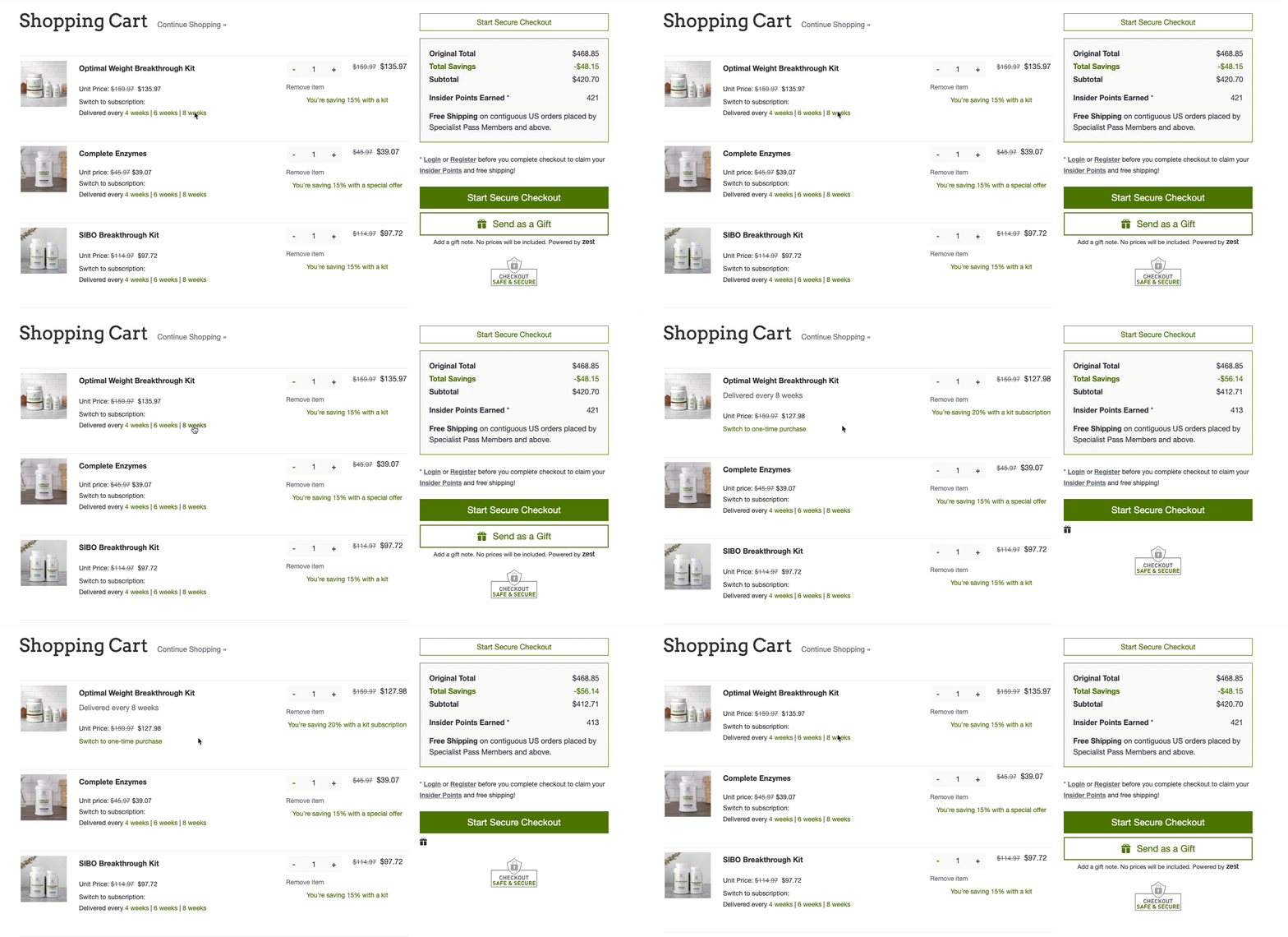
- Customers can switch between one-time purchases and subscription purchases of products directly from the cart.
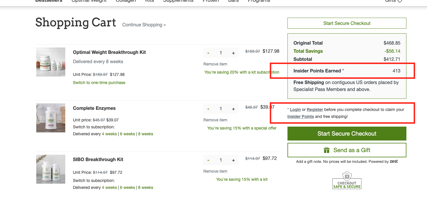
- Customers can see how many points they can earn after they purchase the order if they have an account. This can encourage customers to register and purchase more in the future.
- Customers can start their checkout experience directly from the navigation bar, as a checkout button is available next to the cart. The checkout button is also designed in a way that catches the customer’s eye.

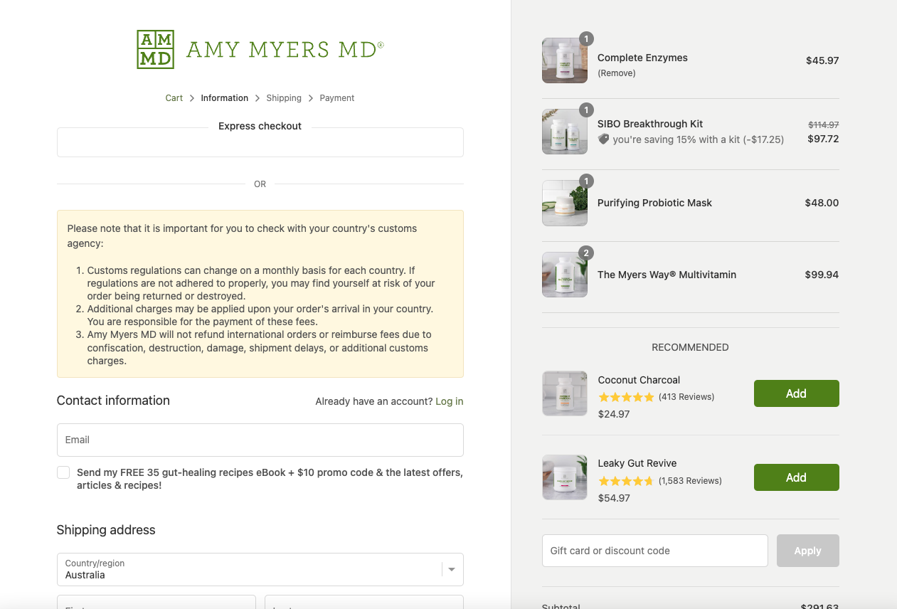
- On the checkout page, customers can see some recommended products under the shopping list. The products have a rating score to encourage customers to purchase them.
3- Effective Product Listing Pages
The product listing display has a significant impact on the way your customers interact with the products. It can boost your B2B ecommerce website’s UX.
Some of the good practices that this website applies:
- The grid view and the spaces between cards are easy on the eyes. It allows customers to browse and compare products.

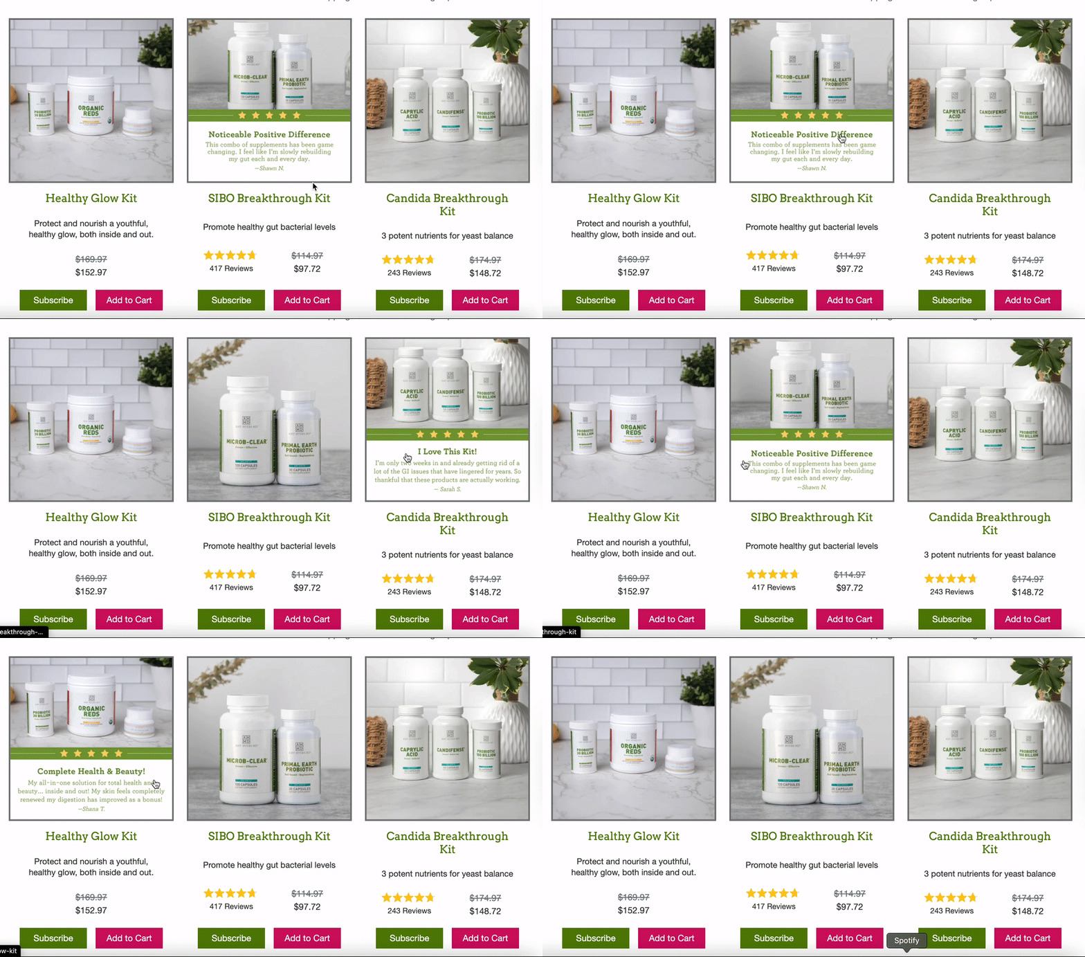
- When a customer hovers over a product image, they can see a review left by other customers that have purchased the product. This encourages the customer to see the product’s details and learn more about it.
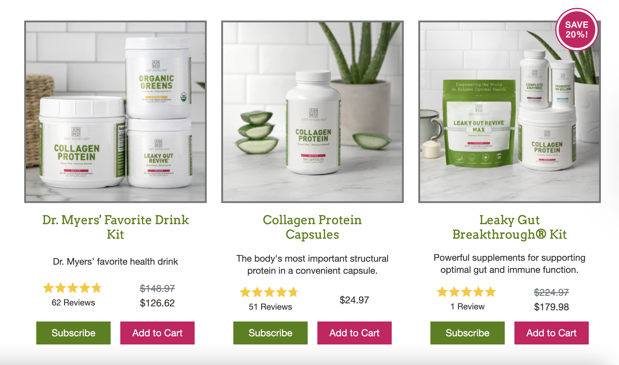
- Products on sale are labeled with a tag on the product card. Customers can also see the prices before and after the sale, and how much they’ll save.
Build your B2B Store with Medusa
With Medusa, the open-source B2B platform, build your ecommerce store to include all these features and more. Use Sales Channels, Customer Groups, Price Lists, and other features to build your B2B ecommerce store.
Learn more here, and follow this tutorial to start building your B2B store.
Want More UX Tips?
This series covers other top B2B websites that provide good UX. Check other parts out to get more tips:
More to come this week!
