I am a UX specialist experienced in both developing and texting great UX experiences.
For this article series, I’ve spent time digging into some of the best ecommerce sites for B2B and zoomed in on what makes them stand out on their UX.
I will go through and dissect the best B2B websites I’ve found one by one. Hopefully, this gives you some inspiration to take into your ecommerce site.
Series overview
More to come this week!
Medusa’s UX and B2B Focus
Medusa provides bespoke commerce infrastructure through its composable commerce platform. Its extendible and open setup makes it well-suited to support cases that require setup flexibility and is easy to customize.
Medusa’s headless architecture makes it possible to build bespoke storefronts that can be optimized to provide a great UX, leading to customer conversion. This is needed in a B2B setting, where most stores are not set up well to cater to the particular needs of a B2B customer.
If you’d like to know more about our product and how we serve B2B users, feel free to visit our B2B page.
Blake
Blake is a market leader in the world of paper, envelope, and postal packaging solutions. Blake's B2B ecommerce has a well-designed homepage, an accessible menu, and direct access to brands, colors, and product specifications.
Blake’s product pages include detailed descriptions and different options to order. Overall, it focuses on attracting customers by providing them with seamless features.
This article explores some of Blake’s powerful UX, such as:
Clean and Clear Menus: design the layout of your menus to make it easy for customers to find the categories they’re looking for.
Informative product pages: provide your B2B customers with all the information they need, encouraging them to purchase.
Next-level filters: allow your customers to filter beyond the filters. Allow them to navigate their way through your products list to find what they need.
1- Clean and Clear Menus
B2B customers often know the exact specifications of the product they want and just want to find it as quickly as possible on your site.
Your B2B ecommerce website should make it easy for customers to scan available products and categories to find what they need efficiently.
Some examples of how Blake does this:
- The typography and spacing used between different elements, products, and categories, make it easier for the customer to scan available products or categories to find what they need.
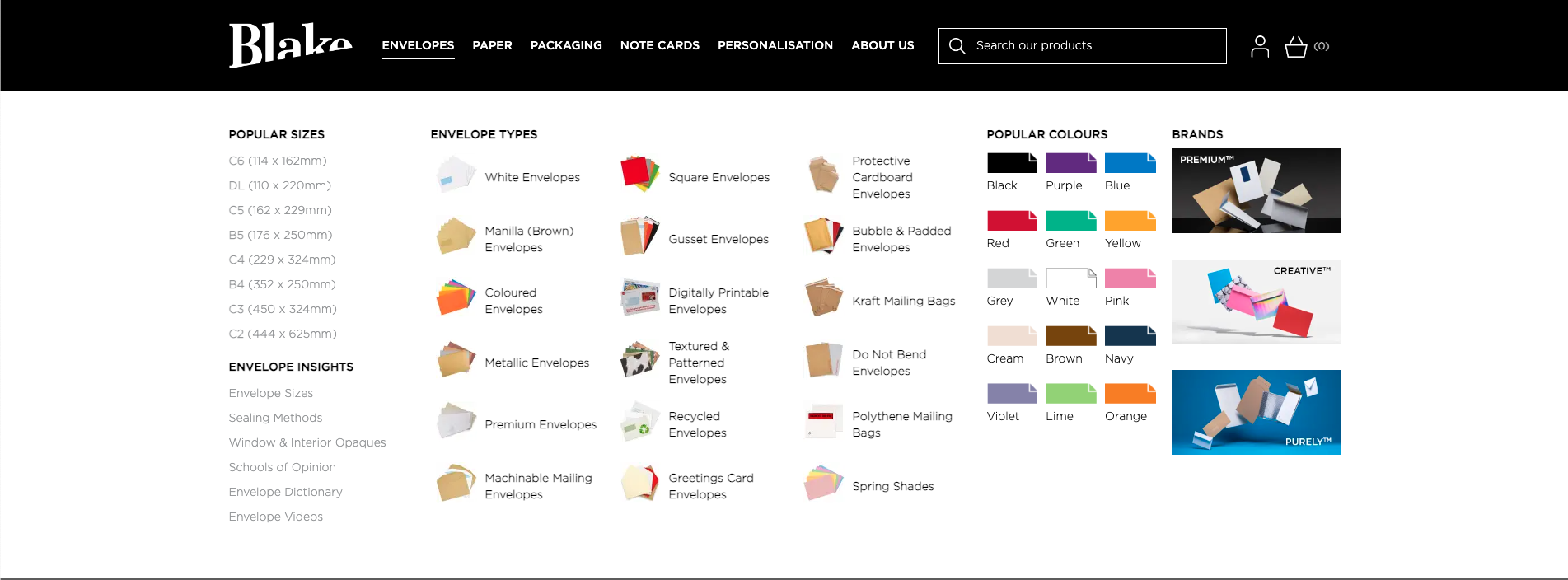
The available options in the menu are grouped into related sets. For each group, concise and descriptive labels are used.
Customers have the choice to navigate available products using sizes, types, colors, or brands.
Different designs for different mega menus, depending on the top category, the menu shows up in different styles and different types of links to promote customers for what matters in this category.
Mega menus are designed differently based on what products are available in the top category of that menu. Customers browsing these menus get a glance of important items in that category.
.gif)
2- Informative Product Pages
The product page should be simple and not stuffed with too much information. This allows the customer to properly focus on the product and its properties.
Some ways that Blake does this:
Product images are of high quality and can be zoomed in, which gives the customer a closer and more realistic look at the product. For products like those that Blake provides, this is essential as customers can almost get the textual feeling of the products.
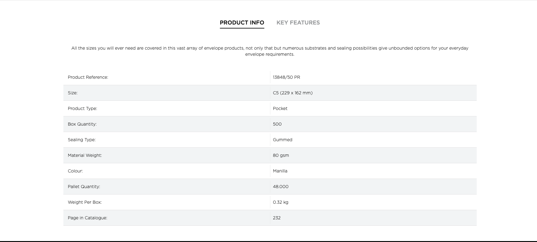
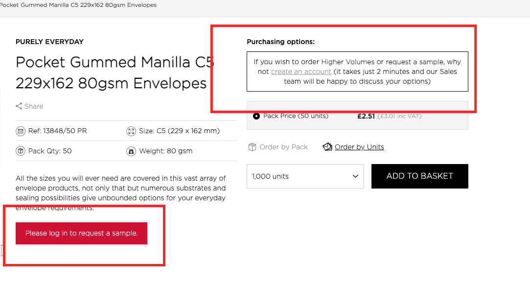
Provide a brief and informed description next to the image and below provide detailed product information in the table. the descriptions are a key area here so clear, well-written product descriptions that help customers to choose the product is the right fit.
Products have a brief description at the top of the page, but more details are shown in a table below it. Customers can use the description to learn the general details of the product, then, if they’re interested, browse the more detailed table.
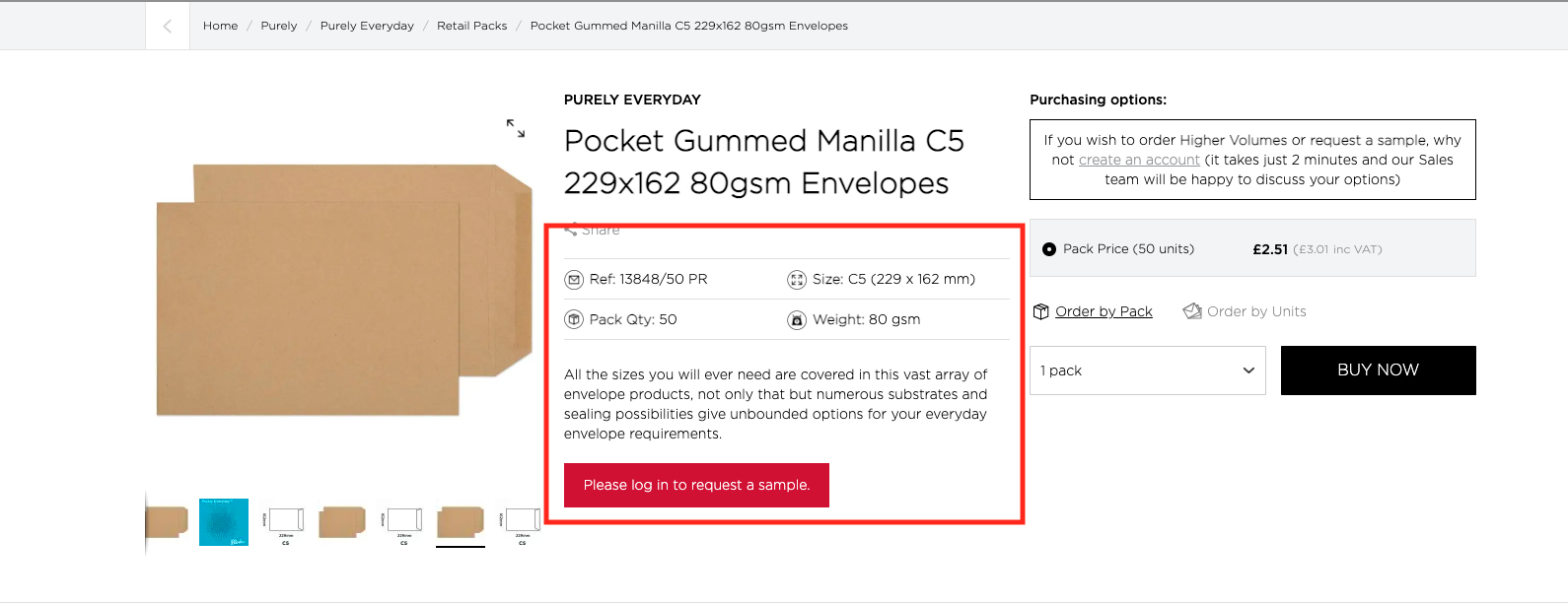
- Breadcrumbs are available at the top of the product page. It helps the customer understand where they are on the website, as well as what category they’re browsing.

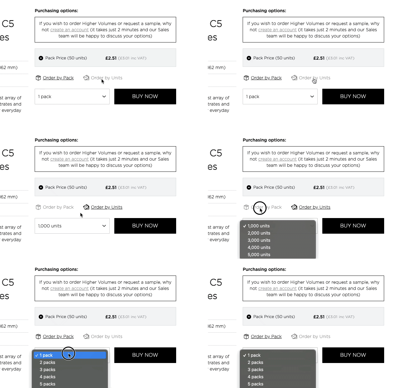
- Customers have different purchasing options, either by the pack or by units. This gives B2B customers freedom while ordering and allows them to easily order large quantities.
- If customers register, they can request a sample or get help from Blake’s sales team when ordering large quantities. This encourages customers to register.
3- Next-Level Filters
Product filters are one of the essential elements impacting your customers’ user experience. Optimizing your product filters increase customer engagement.
Some practices that Blake applies in their product filters:
- Next to filters, the number of products under that filter is shown. This gives the customer an idea of the results they’ll get before applying the filter.
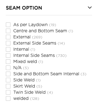
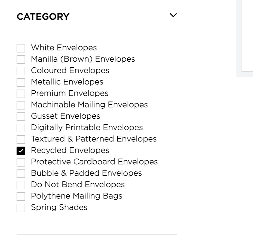
- Customers can see all available categories in the filter. When a filter is applied, not only the products are updated, but the filters as well based on the remaining products. This makes the customer’s browsing experience seamless.
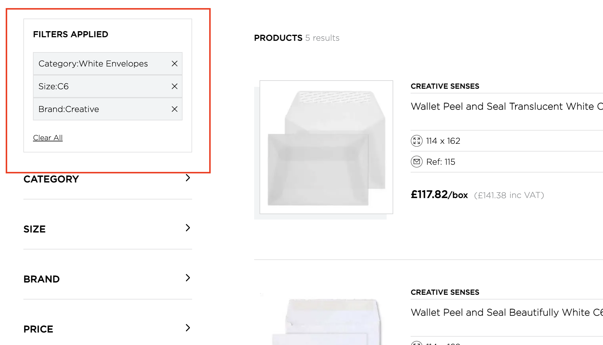
- The selected filters are shown at the top of the filter list and can be easily cleared. Customers can navigate between different sets of filters by just clearing applied filters, then applying new ones.
- The short filter list saves customers time and makes filtering less frustrating for them.
Build your B2B Store with Medusa
With Medusa, the open-source B2B platform, build your ecommerce store to include all these features and more. Use Sales Channels, Customer Groups, Price Lists, and other features to build your B2B ecommerce store.
Learn more here, and follow this tutorial to start building your B2B store.
Want More UX Tips?
This series covers other top B2B websites that provide good UX. Check other parts out to get more tips:
More to come this week!
