I am a UX specialist experienced in both developing and texting great UX experiences.
For this article series, I’ve spent time digging into some of the best ecommerce sites for B2B and zoomed in on what makes them stand out on their UX.
I will go through and dissect the best B2B websites I’ve found one by one. Hopefully, this gives you some inspiration to take into your ecommerce site.
Series overview
Medusa’s UX and B2B Focus
Medusa provides bespoke commerce infrastructure through its composable commerce platform. Its extendible and open setup makes it well-suited to support cases that require setup flexibility and is easy to customize.
Medusa’s headless architecture makes it possible to build bespoke storefronts that can be optimized to provide a great UX, leading to customer conversion. This is needed in a B2B setting, where most stores are not set up well to cater to the particular needs of a B2B customer.
If you’d like to know more about our product and how we serve B2B users, feel free to visit our B2B page.
Massey Ferguson
Massey Ferguson is a world-famous brand supplying a huge range of tractors and agricultural machinery. It provides a limited number of products, but each product is complex and has a lot of details.
Also, each product comes with a manual that allows customers to figure out whether the product fits their needs or not.
This article explores some of Massey Ferguson’s powerful UX, such as:
Intuitive and Smooth Navigation: provide the navigation that helps your customers find what they need.
Summarized Product Section on The Homepage: the homepage is typically the first page your customers will see. Utilize it to show your customers what your store offers.
Highlighted Promotions: motivate your customers to purchase by emphasizing the promotions you offer.
1- Intuitive and Smooth Navigation
Your website navigation menu is the key to success in your ecommerce website. The easier and more engaging your navigation experience is, the easier it will be for customers to find what they need.
Some good navigation tips that Massey Ferguson applies:
- In the products dropdown menu, customers can see the main two categories at the top of the menu and can select one of them based on what exactly they looking for.

- When a customer hovers over one of the subcategories, the product names under these subcategories are shown next to the main category. This gives the customer a glimpse of the available products before diving into a category and helps narrow their options.
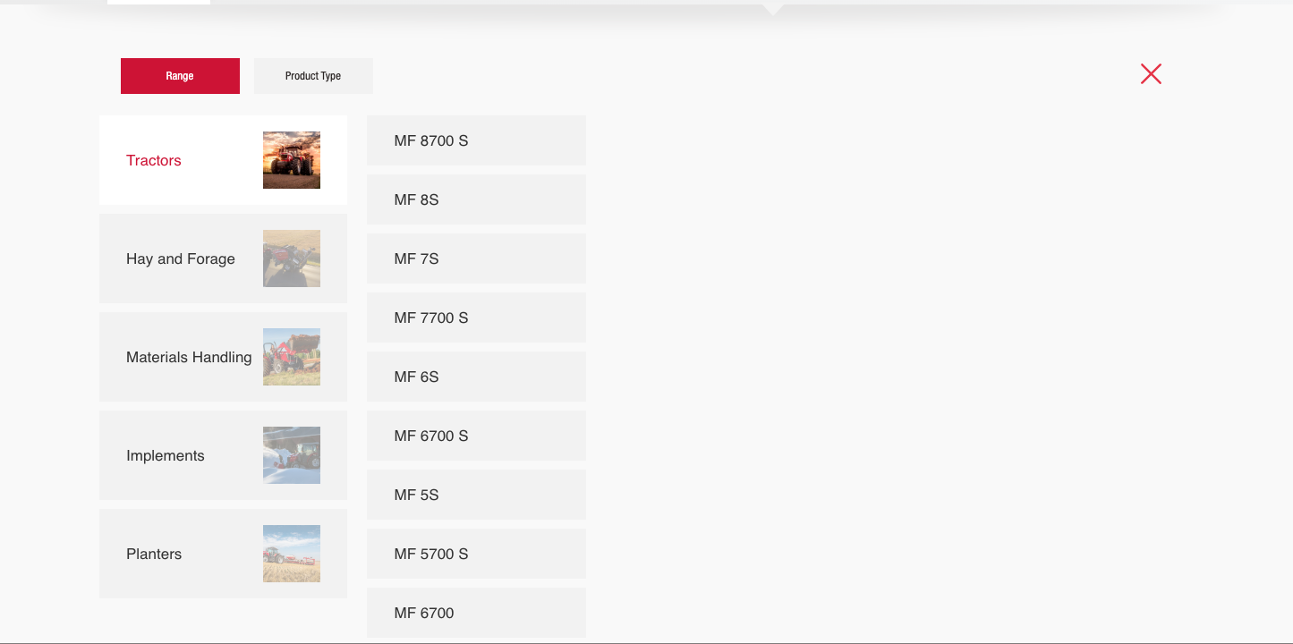
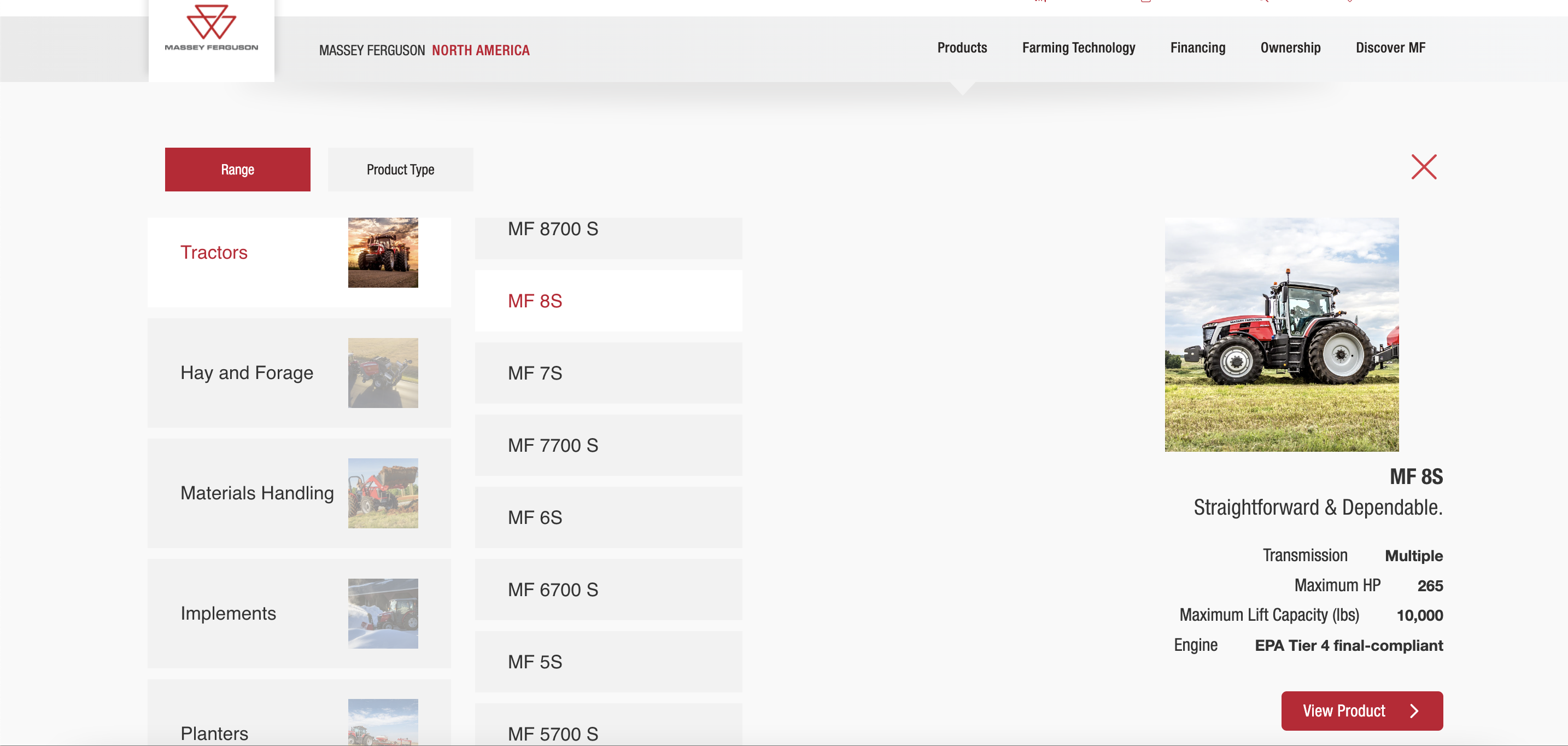
- Similarly, when the customer hovers over a product’s name, the product’s image and details are shown in the menu. Customers can easily navigate between available products before deciding on which one fits their needs.
2- Summarized Product Section on The Homepage
As the homepage is most likely the first page a customer will see of your website, you can utilize it to show a selection of your store’s products.
For B2B ecommerce websites, the homepage should show the customer what this store specializes in and the overall available products and options.
Massey Ferguson utilizes the homepage to showcase their available products by doing the following:
- Customers can see the main categories on the home page as filters. They can choose between the available categories to get a quick overview of the available products under that category.
.gif)
Quick view to view more information for all products in the grid, or per product instead of viewing the product page. Other information can serve as a significant motivator for different types of customers, so Include information extras that will nudge customers to purchase.
The products’ main details can be easily viewed right from the homepage by toggling the Quick View option. Customers can easily find what they’re looking for without leaving the home page.
.gif)
- Product details are shown as short details with clear icons. Customers can easily scan the details of the products in seconds.
3- Highlighted Promotions
B2B customers come to your store with specific products in mind, but promotions are always appealing. It’s important to properly highlight your promotions, as it catches the customer’s eye immediately.
Massey Ferguson does a good job of highlighting its promotions:
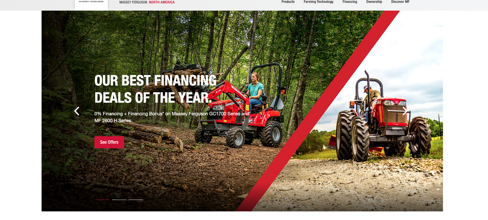
- Promotions are shown in the hero section, which is the first section of the website that the customer sees.
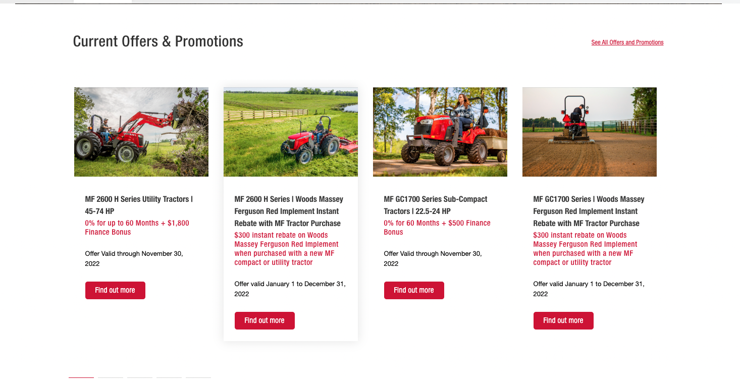
- On the Offers page, promotions are shown with an expiry date. This urges customers to quickly purchase before the promotion ends.
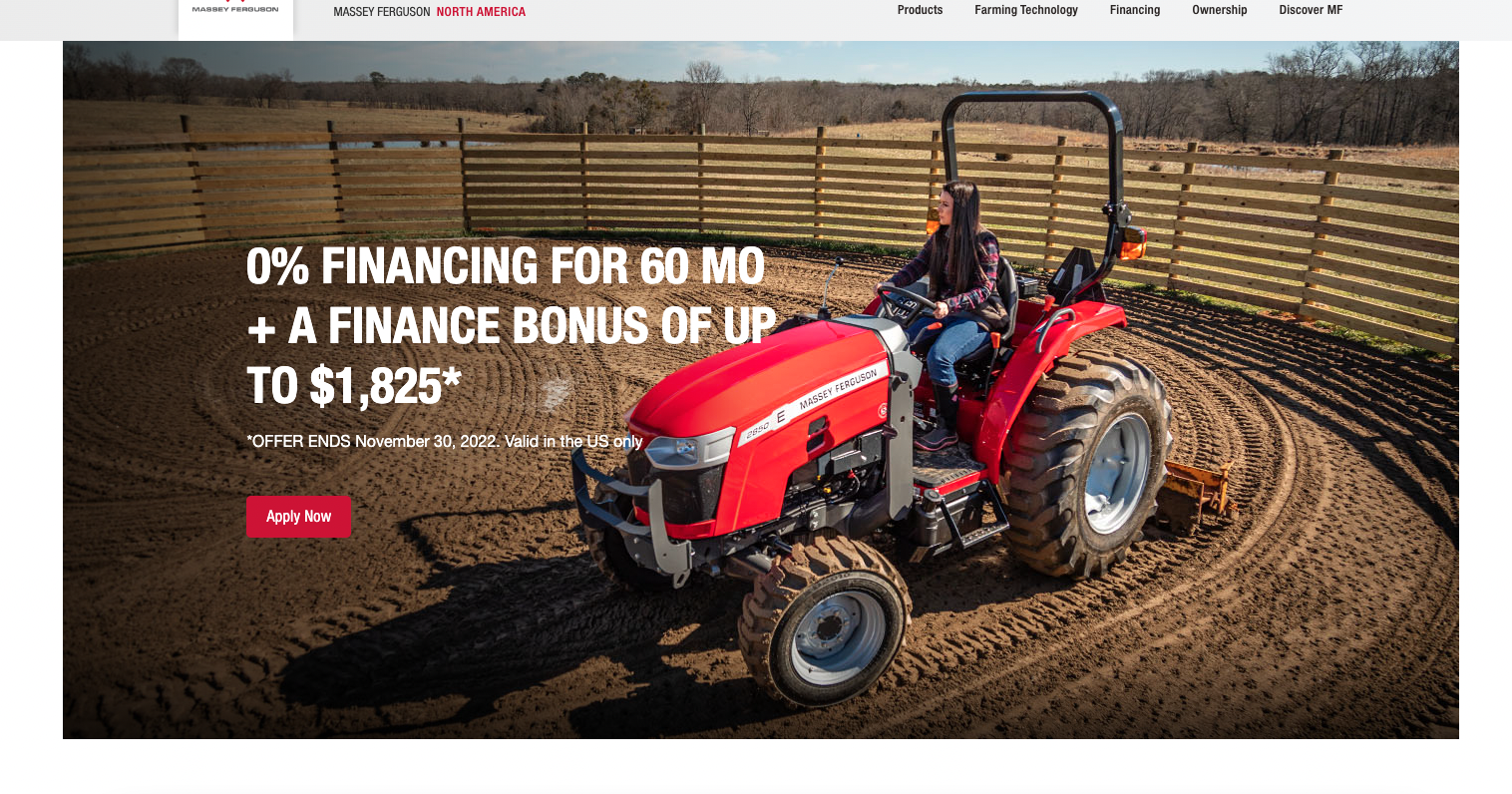
The offer details are noticeable, and the time of the offer is spotlighted on the product card, to ensure that all customers are aware of the promotions details and it’s impossible to miss. Also, it’s easy to check more details by clicking the “Find out more” button which opens the details on the same page and that doesn't distract the customer by navigate between pages.
For each promotion, its details and expiry date are shown in the offers list. Customers can check if there are any promotions for the products they want to purchase directly from the list.
Build your B2B Store with Medusa
With Medusa, the open-source B2B platform, build your ecommerce store to include all these features and more. Use Sales Channels, Customer Groups, Price Lists, and other features to build your B2B ecommerce store.
Learn more here, and follow this tutorial to start building your B2B store.
